| |
|
|
| |
 |
|
| |
|
| |
|
| |
| |
| |
|
| |
Motivational Tips |
|
From Brett: |
Values
Values are tough. It’s difficult for me to compare relative
values, especially on the bright computer screen and then
translate that to pigment. The value range from black to white on
the screen (and in life) is so wide compared to the reflected
light off the painting. Squinting kind of works, but I needed
something else to learn how to compress the values I see in real
life into the limited value range available in a painting.
Digital value scale
In Photoshop I converted an image to black and white. Then I
created a digital value scale simply by adding 5 little
rectangles. One is filled with pure white, one black, the middle
one at 50% gray. Then the other two are filled with 25% and 75%
gray. Piece of cake. Now I can squint down and compare values in
the reference photo to the value scale.
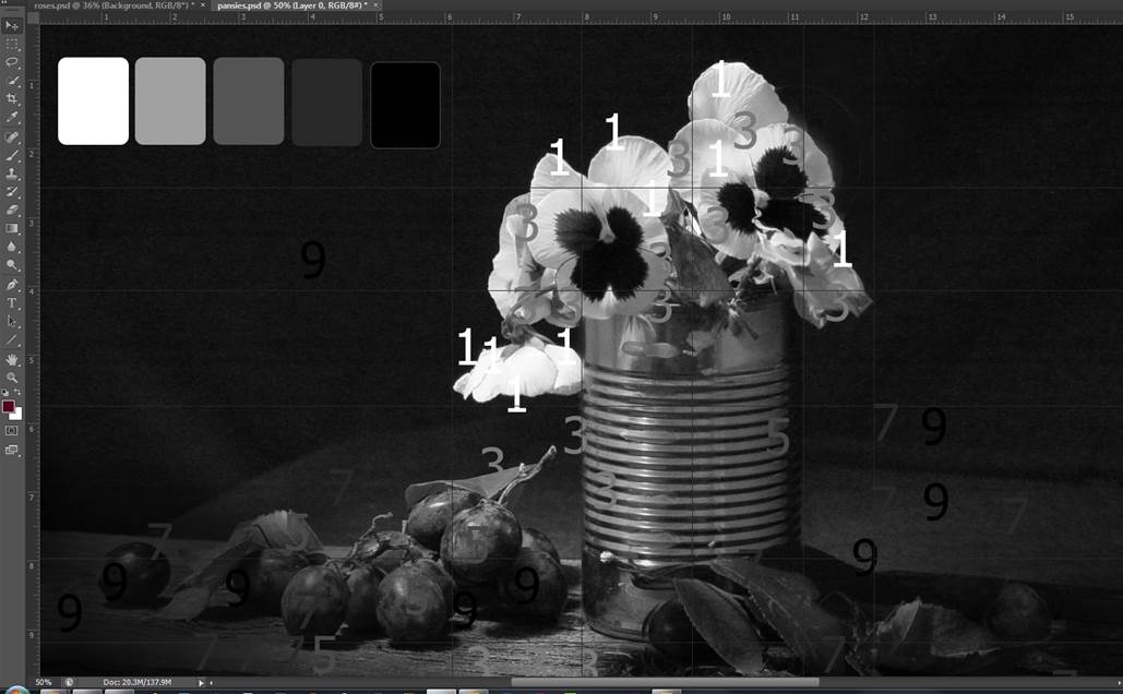
Extra value help
As an added help I place numbers on top of the image that were the
5 different values of gray. So the number 5 has a gray shade of
50%. I can drag those numbers around the image and when the number
disappears, I know I have a match. If the number looks darker than
what is under it, I know what is under it is lighter- so the
flower is lighter than a 3 in most places. I also create
guidelines in 50% gray. Again if part of the line looks light,
then whatever is under it is darker than middle gray. (I also use
the ruler guidelines for drawing reference. The photo is cropped
at the same size as my canvas so the ruler lines are to scale.)
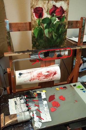
Converting screen values to pigment
Now I know on my screen how dark or light something should be, but
I can’t hold up my brush with paint on it and compare because the
paint always looks darker to me, especially when using the
computer.
So the secret is to use premixed grays from the tube as way to
compare your mixes with the values on the value scale. I use
Gamblin Portland Grey Deep, Medium, and Light as the 3, 5, and 7
on the value scale-- the grays perfectly matched up with a value
scale I painted a while back (see the photo below). I lay out the
five values from the tube on my palette every time I paint, more
as a way to compare value than to actually use the pigment. Wet
paint always looks different on the palette than on the painting,
so having it there on my palette to compare is really helpful.
I also painted the value scale from the gray tube paint right on
my easel.
I highly, highly recommend Photoshop as a tool for painters.
Yes, there is a learning curve, but don’t let that stop you from
its benefits! The complexity is what gives you power-- it has some
really great tools for painters. Plus you don’t have to learn all
of the features to benefit from it. Just learn a few at a time. |
| |
| From Kay: |
| There are so many things I use and do for
motivation other than having this desperate drive/need to paint,
(it is so unlike when I was woodcarving or creating my own
patterns with fiber) Some of the things I do is surf the Internet
for pictures or see what other artist are painting, look at the
old master's paintings & study them, listen to audio books
pertaining to art (I just listen to B. A. Shapiro 'The Art Forger'
good book by the way) Then again I listen to audio books while I
paint also, once in awhile I'll listen to 'Ludovico Einaudi' or
good old classic rock. What really helps me a lot is watching
people paint on YouTube or putting in a painting DVD (yours of
course) and talking with other artist, bouncing ideas off each
other. |
| |
| From Karen: |
I carry around a small sketch pad with me
always and when I have a few minutes take it out and sketch either
ideas I have in my head or what I am looking at around me if
something inspires me. This always puts me in the mood to paint
and gets me motivated. To me it is less intimidating than thinking
about painting but gives me the excitement to want to take out the
brushes.
|
| From Cheryl: |
I haven't been painting much lately, but I still
study. The more I learn by observing gives me confidence that when
I do pick up my brush, the results will show improvement in
technique, color or composition. Studying a master painter's
technique is like having a magician reveal his trick. Once the
mystery of a technique is understood, I become increasingly
convinced that "I can do this!" The possibility of creating an
exceptional piece of art excites me and continues to motivate me
to learn even more.
Ever get the sense that the paint loves you back? I have and
without a doubt, I can largely attribute that to your teachings
Dan. Thank you a thousand times over for sharing your knowledge
and passion for painting.
|
| From Helga: |
I just ordered plain air and floating frames from
Dick Blick and Jerry's to compare the two. The floating frames
work very well with the fiber boards. I will paint the sides and
back with black and then screw the panel into the frame. They look
good and give a painting more of a contemporary look.
The 3 inch wide gold-silver-bronze frame are great for still
life's and gives the painting more of a classic look.
Jerry's frames come with the hardware and the back has a nicer
finish. Dick Blick has a 'made in Mexico' stamp (an unfinished
look), but you can paint over it.
I eventually like to make my own frames and that will be worth the
time when my paintings have improved.
Having a very professional look and offering a highly professional
painting on line is very important because you create a reputation
and from experience it is important to have a good reputation. It
just takes one item that can harm that reputation, if it is
inferior. I like to offer my paintings in a frame with all the
hardware attached including a hook and easy to hang when the buyer
receives his or her painting.
Sometimes I have a painting hanging on the wall for a couple of
month before I finish it. It gives me a chance to be objective and
think about what other brushstrokes are needed before I put it up
for sale.
|
| From Jason: |
|
Here's my tip…One of the best tips/advice I ever
learned for how to do highlights comes from the late Helen Van Wyk.
When applying highlights to an object her rule of thumb was "Make
it, Break it, Make it again." In other words, apply your highlight
and then blend it in slighty with a soft brush to diffuse it. Then
go back again and put a stronger stroke into the middle of the
blended highlight.
I find this works very well 90% of the time. The only time I
wouldn't use it is if you are painting a super shiny object like
glass…then the
highlights are usually very crisp.
Hope this helps my fellow AMP'ers! Thanks… |
| |
| From Kathy: |
|
First of all looking around in my studio and seeing improvement
really motivates me! Thanks for all your instruction.
My first art instructor said that as soon as you start to paint
you will never see things the same again. I know she was right.
I might see a blade of glass with the sun hitting it and think I
would love to paint that. I never walk now with out my camera.
In fact, I have thousands of photos waiting to be painted.
|
| From
Ellen: |
For Motivation or
inspiration I go to places where creative people work.
There is a great floral shop in the next town where they design
and make their own incredible live and artificial arrangements,
they take every day objects and invent new ways to make flower
arrangements with them. They sell their leftover supplies and I
buy some and update my own decorations.
Quilt shops! All those colors and patterns!! There are finished
quilts and wall hangings on display over the racks of fabrics that
I find inspiring, other people also like color and composition
without ever using a brush.
Auctions and Antique shops too. There's always somethings from the
past that brings back a memory. I like things that have character
and have survived through time.
Nature and sunrises, everyday they are a different arrangement of
bold or subtle colors |
| |
| |
| |
|
 |
 |
 |
 |
|
|
|
|
|
|